

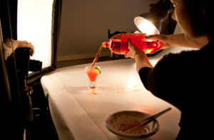
 Ever wonder how grocery retailers and brands get their food to look so tempting in advertisements and on packages? The secret isn’t having a trained chef prepare those meals. Instead, it’s about having a talented food stylist, photographer and photo editor—and sometimes the right hair gel.
Yes, that really does say “hair gel”—and no, it’s not a typo. “To get the perfect shots of cereal, we use hair gel in place of milk,” explains Autumn Underwood, photographer for Daymon’s Creative Services group. “It doesn’t harden, so you can still manipulate the cereal. And it doesn’t make the cereal soggy, so you don’t have to worry about getting the perfect shot right away.”
Underwood works with a team of designers, food stylists and digital editors to bring retail packaging designs to life for Daymon’s private brand clients. She explains that the main rule of thumb in food packaging photography is that whatever’s actually being sold inside the package has to be the real thing. But anything else is fair game—hence the use of hair gel as milk on cereal packaging.
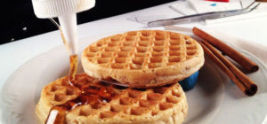
Some other tricks of the trade Underwood and her team have used include boiling down maple syrup until it’s more like taffy so it can be pulled into just the right “drips” on waffles—and shaping ice cream over hollowed out tennis balls filled with dry ice to keep it from melting. When it comes to getting mouth-watering shots of proteins, they might add cherry or beet juice to beef to get the perfect red center, or use individually heated skewers to get just the right grill marks on chicken.
But it’s not always just about making food look as appetizing as possible. Some clients have very stringent guidelines for what they want shown on the package to ensure there’s no room for accusations of false advertising. For example, Underwood says they had one client who required exactly 17 pieces of pepperoni to be shown on their frozen pizza, and another who wanted to be sure the shot for their assorted jelly beans showed exactly the same number of each color bean.
 In her 10-year tenure at Daymon, Underwood has seen numerous trends in food photography and package design come and go. “We’re using more rustic backgrounds and props as compared to five years ago. For example, where you used to see BBQ sauce in a white ramekin, now we might show it in a glass jar with a drip of sauce coming over the rim and a basting brush next to it.”
Digital editing tools have also changed the nature of the work. “We shoot a lot of things on white or gray backgrounds so we can isolate them and put them on different backgrounds,” explains Underwood. “This makes it a lot easier to address customer changes, and also to create consistency across designs with multiple flavors of products—ensuring the ingredients are all shown at the same angle and in the same light.” It’s this attention to detail that keeps Daymon’s Creative Services customers coming back for more.
To learn more about Daymon’s retail packaging design services, contact Jim McIntyre, Senior Director of Creative Development and Execution, at jmcintyre@daymon.com.